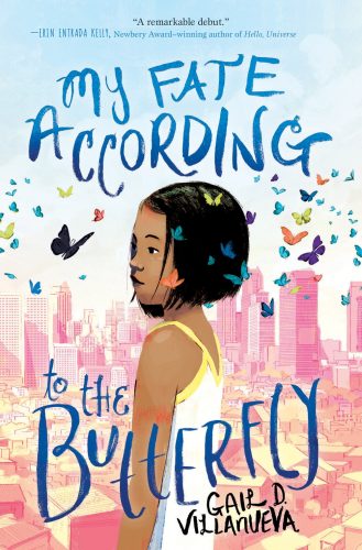
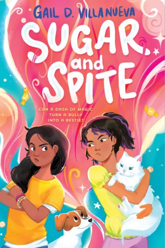
I honestly didn’t plan on changing my site’s design so soon. But the old one was just so gloomy, and I wasn’t happy with it.
Besides, Mister Kapre is gone. Our neighbor’s mango tree, where the kapre supposedly lived, had been cut down. Got uprooted during a typhoon. Call me superstitious, but I don’t want to “talk” to the kapre and give him the wrong impression we’re welcoming him here. We already have so many animals running around, thank you very much. I’ll probably just keep the heading “Kapre Dialogues” in memory of the displaced fictional giant, but that’s about it.
I don’t usually praise my own design work — because in my 20 years of doing web design, I always find ways to make my designs better — but I’m loving this new theme. The colors are brighter, and it’s got the happy feel I wanted. I write mostly MG/YA stories anyway, so might as well make something that’ll appeal to kids.


