Remember when I said I just cannot blog if my website’s design was a mess? WELL. Apparently, it takes me just a year to get bored with an existing layout. But you know, I think this one’s gonna be it!
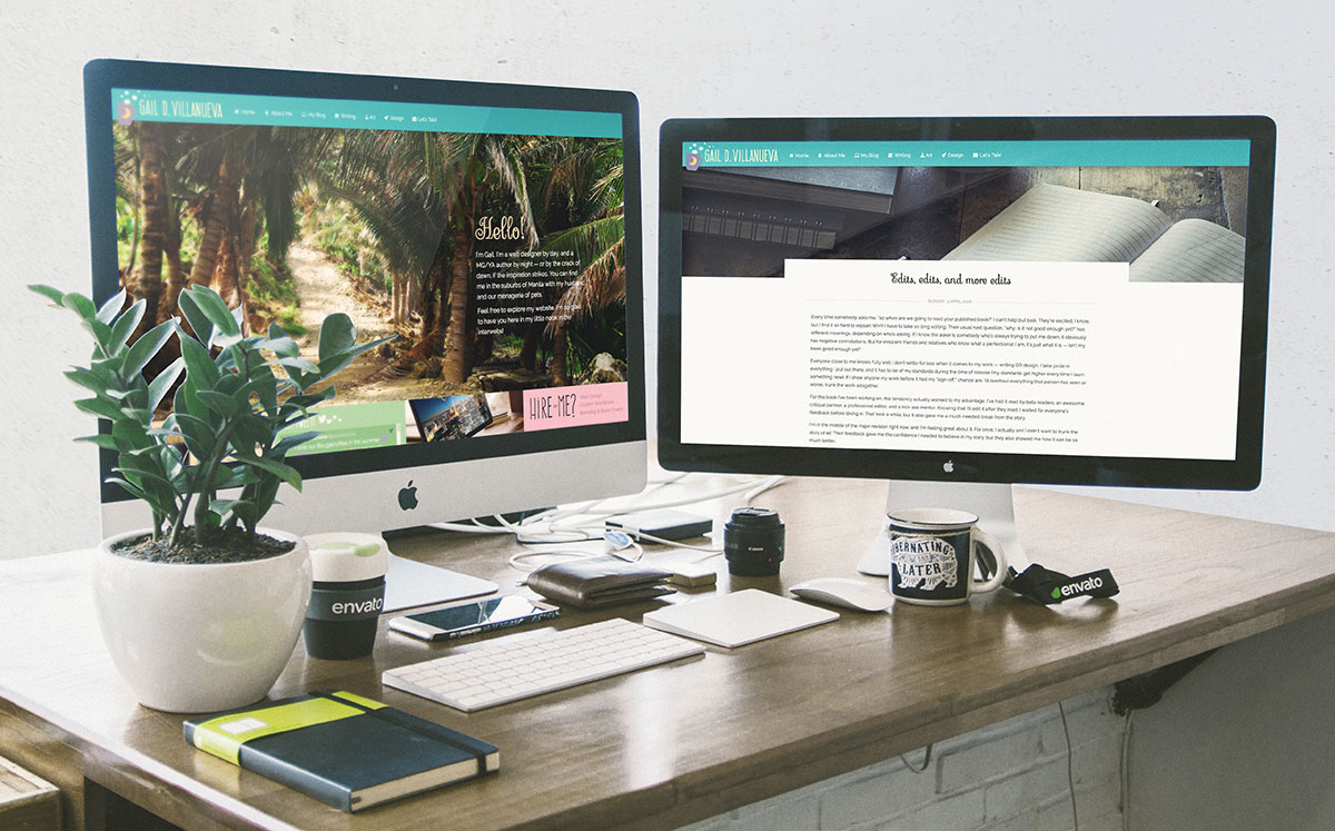
Okay, I’ll be honest. This will probably stick for a year (or two, if I’m lazy), but I have a good feeling about this new design. The colors are my absolute fave. That very same aqua and purple combination almost made me spend unneccessarily on a really cute travel pillow with the exact color scheme. If my younger sister (but obviously more financially responsible) hadn’t been with me, my husband, Marc, and I would have ended up arguing over the useless purchase.
Now I have a website that actually has the colors I want. The last design was near it, but didn’t quite nail the colors as much as I want. Nor could it exemplify both my writing and art styles. I wanted something whimsical and colorful, but at the same time, clean and professional. Oh, and let’s not forget the Filipino touch, as most of my stories are set in the Philippines. I’m not being an egotistical jerk or anything, but I think I finally nailed it with this one.
Can’t say I won’t change my mind later on. The web designer in me will always want to update this. I keep learning new things while solving client requirements. Of course, I’d want to apply these new techniques on my own website. But this is the theme in the meantime, and I do hope you guys like it as much as I do 🙂
P.S.
I’m planning to accept freelance web design commissions again. If you’re a writer, you like my work, and plan to hire me, sign up for my mailing list! I might have something in store for you when I’m open for work.

